Contextual and Representational Data Quality in Data Visualization
Pillars of Effective Data Visualization
In recent years, we've heard a lot about good design, UX/UI design, color theory, and even data visualization. There's even Tik Tok's revolving around how understanding color theory can help you mess with the user's perception of color. There's been articles about using the correct charts, the best tools, and the biggest names in the field. But the majority of those have a common understanding that at the end of the day, the use cases differ so enormously, it's impossible to satisfy every scenario.

When talking about data visualization in general, there are a couple of»rules« you are supposed to follow. It's always regarding color selection, chart type, object size, and clear lettering (either headings or data labels). There are also a couple of Few fans that will tell you to omit the pie chart where possible because the human brain isn't really that great at telling you how big a pizza slice is, whereas estimating the height of a bar chart is a pretty trivial task.
Because all of those are covered in a hundred different ways in a hundred different articles, we're going to be dissecting the Wang & Strong (1996) data quality framework, and applying it to data dashboards.
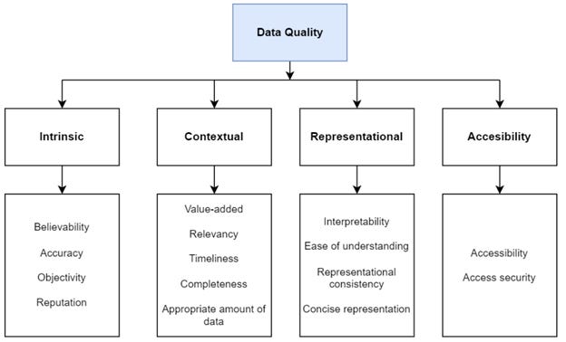
The Wang & Strong data framework takes on the task of splitting data quality (DQ) into 4 different settings – Intrinsic, contextual, representational, and accessibility.
Intrinsic DQ: data has quality in its own right. That means the data is believable, accurate, objective, and well-known. It is a trustworthy source.
Contextual DQ: considering the data within its context of use. This lies within the relevancy, timeliness, completeness, and value-added of the data.
Representational DQ: the data is presented in an easy-to-interpret way, that is understandable but also consistent and concise. For example, if the audience is English-speaking, the data should not be presented in a foreign language.
Accessibility DQ: the data is accessible by the user, while still being as secure as possible.
To take the framework into account, we'll be applying it to the visual type and color selection, but in a way, you can apply it to any dashboard you'll ever make. In order for this to be a bit less complicated we'll be focusing mostly on contextual and representational DQ. The intrinsic DQ is something a data engineer and business users are responsible for, while the accessibility is something a security specialist is responsible for.
Contextual Data Quality
Firstly, we'll look at contextual DQ. The entirety of it focuses on the relevancy and appropriate amount of data, which can very quickly go from »not enough« to »too much« on a business intelligence (BI) dashboard.
Representational Data Quality
Secondly, representational DQ is how well you understand the data, and how easy it is to interpret. It is usually the main indicator of a good dashboard, and the thing that sets beginner and expert BI reports apart.
The Impact on Data Quality
There’s several things that impact data quality, but let’s take a look at a few that you’ve probably used before when building reports.
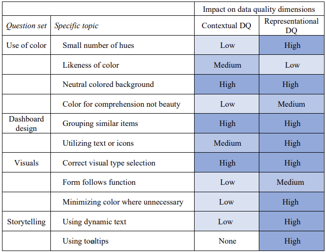
The topics are divided into the use of color, dashboard design, and visual selection. There’s an additional segment on storytelling, where you explain the data and not just show it - just ask Cole Nussbaumer Knaflic. The table below is an excerpt from my master’s thesis, where I dived into the elements that affect users’ understanding and likeness of a dashboard.
High impact
As seen in the table, one of the most impactful things that can make you go from 100 to 0 (or vice-versa) quickly is the grouping of similar items. This stands for grouping slicers, graphs showing the same data together, and KPIs together. That way the users know right away where to look to gather information. The grouping doesn’t have to be literal - it refers to the placement of the items and not you drawing boxes around them.
The other highly important part is the selection of the correct visual type. You can have the best quality of data, the best data pipeline behind it, and the brightest ML engineer on the team. Yet - if you’re going to take a pie chart to show 72 different groups of data, all of those aforementioned people are going to cry (pro tip: only use pie charts to show parts of a whole of 3-5 slices max).
Medium impact
The first thing here would be to minimize the number of hues you’re using in your dashboards. Most people say “colors” when referring to hues, but basically, you can choose a blue hue and have 50 different color variations of it because of lightness or luminosity. So be brave and play around with the brightness of color to create a sense of importance and stop using bright red and green to try and shove information down people’s throats (or eyes in this case).
You should also utilize text and icons where possible and needed but try not to over-clutter the dashboard. Sometimes it’s easier to understand the point of a visual if you show an up or down arrow to show the trend the data is making. And if the user wants to dive deeper into it, they still have the option to do so. It’s also easier to distinguish information from a heap of data if you use text and icons.
Low impact
Some people will forever try and chose a color they love because it will make the dashboard prettier. There will also always be people telling them that the pretty pink they chose is ugly and makes the data incomprehensible. They are both wrong. If the color is used wisely, it more or less has no impact on the comprehension of the data. If the color chosen is the best possible neutral blue on the other hand, but it’s used everywhere, it just as well makes it a bad color. So, the color selection has a much lower impact on DQ than the actual usage of the color itself.
These were just a few examples of which elements have an effect on your data quality according to the Wang & Strong DQ framework. There are always situational factors and the company colors you have to take into account. And there will always be someone better at UI/UX than you might be, but that doesn’t mean that your dashboards are bad. Showing data is the first step, but chosing the data wisely, the colors smartly, and the positioning well - that’s how you become a master.
Tina


